In a city known for its unpredictable dating scene, symphonies of red roses, white lilies, and pink carnations travel from one place to another on the subway every February 14. Running through the Big Apple, passion and love flow through our streets and subway system, much like the data that shows how the city moved on Valentine's Day.
Thanks to MTA’s Open Data Program, accessing and analyzing vehicle crossings and subway ridership data has become easier than ever. We provide publicly available, historical data as part of our commitment to transparency and public engagement, which offers us a deep look into NYC’s travel behavior. To uncover Valentine’s Day travel data, we’ll examine:
- MTA Bridges and Tunnels Hourly Crossings: Beginning 2019
- An operational count of vehicle crossings on MTA-owned bridges and tunnels, which allows us to explore traffic patterns by location and time.
- MTA Subway Hourly Ridership: Beginning 2025
- Station-level ridership estimates on an hourly basis, where we can identify peak travel times and commuter behavior.
In this blog post, we’ll walk you through an example of how to export big open datasets, transform them into meaningful visualizations, and draw data-driven insights. Whether you're a full-fledged data analyst or just curious about how New Yorkers move through the city, this guide will equip you with the tools to create an analysis that sheds light on the rhythms of New York’s love life—at least as far as our data can tell.
Data preparation and exporting
Before diving into the analysis, let's cover the data export process. DuckDB makes working with large datasets remarkably straightforward. This powerful analytical database lets you query extensive data without downloading it—ideal for frequently updated information. With just one click to run your query, DuckDB combines simplicity and processing power to handle your data efficiently.
Since we’re working with big datasets, we used an open source data-export.py script (thanks to Open Data user Mark Bauer!) to extract data via the Socrata API from data.ny.gov. We found this to be a simple and powerful tool to use, and only requires updates to a few parameters: export log text file name, API link, and output database file name. It even handles pagination by using offset parameters, and rate limits by pausing between API requests. After executing the script, the respective datasets are stored into a database, which allows us to apply transformations and then visualize them using a Jupyter Notebook file (.ipynb).
In an earlier blog post, Dodge the crowd, we provide more details on how to access and query Open Data, including demos with our MTA Subway Hourly Ridership dataset. We hope these tools empower our data users to explore the data, and we highly encourage filters on the big datasets prior to doing so. For example, some questions we can ask to guide our analysis are: Where do New Yorkers venture out for romantic evenings? Does the day of love bring an unusual lull to both subway stations and vehicle crossings? Have typical transit patterns shifted on Valentine’s Day? Like any data project, we can identify our assumptions and limitations within the data to make the best insights possible. While we can’t make any conclusive statements regarding the patterns from only a few datasets, we can certainly put on rose-colored glasses to try and understand commuter behavior on this meaningful day.
Love on the move
Due to Valentine’s Day’s popularity, we hypothesize an earlier end-of-day peak in vehicle traffic and subway ridership with the assumption that people leave work earlier to celebrate. Additionally, this year Valentine’s Day fell on the Friday before the three-day Presidents Day weekend, which may have caused a surge in outbound traffic as lovers headed for a romantic retreat.
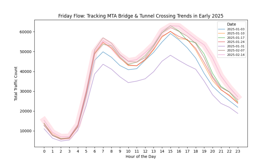
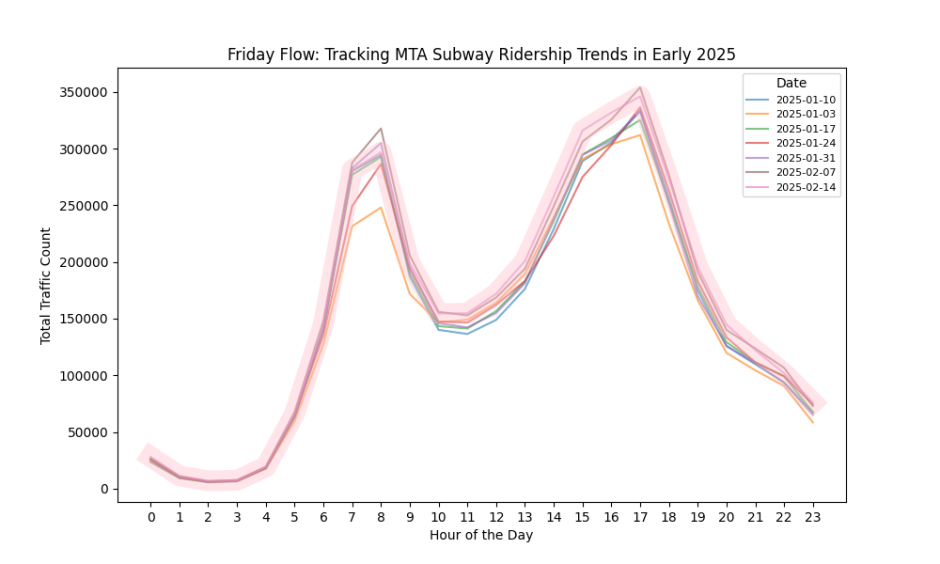
Since Valentine’s Day fell on a Friday this year, we begin with filtering our datasets to isolate all Fridays Year-to-Date (YTD) for a high-level view of this time-series. In Figure 1a, we use the MTA Bridges and Tunnels Hourly Crossings dataset to sum hourly counts for each Friday and visualize this across time with line plots. As pictured in Figure 1b, we apply the same analysis to the MTA Subway Hourly Ridership dataset to compare transit modes in an attempt to identify larger trends in user behavior.
On Friday, February 14, vehicle crossings were slightly higher than on previous weeks, with a spike between 6 p.m. and 11 p.m. This closely mirrors the observable spike in subway ridership trends as there are distinct ridership peaks between 3 p.m. and 5 p.m., which is expected in both datasets as the typical time for commuters to leave work. What we notice is unique to Valentine’s Day is a surge in vehicle traffic during the evening peak, and a slightly earlier shift in evening commutes across both populations. Could this be from people leaving work earlier to celebrate with loved ones or leaving the city for a long weekend retreat?
Cupid’s rush hour: How Valentine’s Day alters traffic and ridership
To quickly observe trends within our two populations, we use Seaborn’s 24-hour heatmap chart to compare Valentine’s Day with an average of Fridays YTD, where a positive difference indicates a larger volume on the former. These heatmaps reveal variations in counts across each dataset over each hour of the day, where the color intensity correlates with the locations and times that experience the largest differences. This graph is a useful tool to efficiently measure multiple variables—location and time—across different subpopulations—a single Friday versus the average Friday—together for a medium-level analysis.
Figure 2 shows us a strikingly uniform pattern when comparing traffic counts on Fridays: all vehicle crossings increase. Notably, we can see the pronounced increases for Verrazano Narrows Bridge, Triborough Bronx Bridge, and Bronx-Whitestone Bridge.
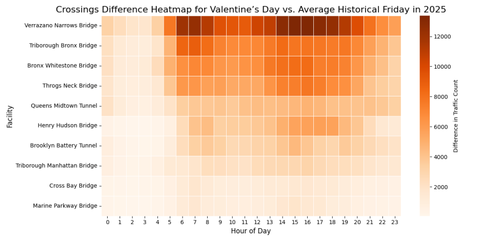
This consistent increase in vehicle crossings raises questions: Are New Yorkers more likely to travel to specific locations to celebrate, and do we see a similar pattern in subway ridership? To help us understand further, we analyze subway ridership trends by using the same heatmap chart and updating the population accordingly. To adjust the context of travel to be within the subway system, we use an aggregation of ridership counts across subway stations but keep the remaining variable of hour of day and comparison function consistent, as shown in Figure 3.
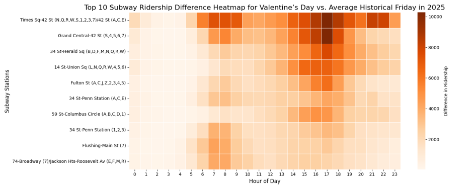
Times Square stands out with an almost 13,000 rider increase compared to its YTD Friday average (+9.8%), highlighting its potential popularity for Valentine's Day activities like Broadway shows and romantic dinners. The influx in ridership at major stations such as 34 St-Herald Sq and 14 St-Union Sq suggest that its shopping, dining, and entertainment hubs attract more foot traffic on this day.
When examining borough-level data in Figure 4, Manhattan shows the most dramatic “Valentine's Day effect” with ridership reaching 2,109,393 on February 14, 2025—a nearly 7% increase over its YTD Friday average of 1,972,850.
But this “Valentine's Day effect” extends beyond Manhattan, with all boroughs showing higher ridership compared to their yearly averages, as shown in Figure 4. To ensure consistency, we use the average Friday ridership YTD as a baseline comparison.
- The Bronx experienced a 7.12% jump (from 273,542 to 292,804).
- Queens saw a 6.5% rise (from 562,787 to 600,285).
- Brooklyn ridership increased by 6.3% (from 845,468 to 898,273).
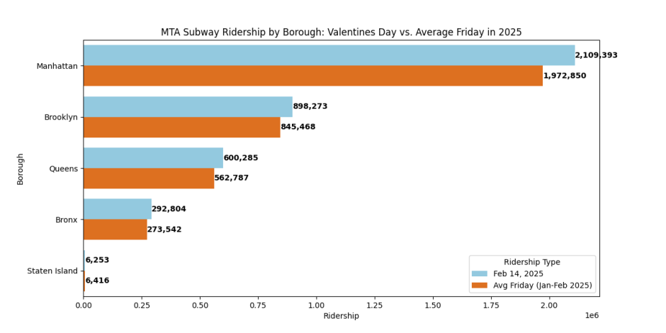
The notably higher percentage increases in outer boroughs likely reflect a combination of residents journeying into Manhattan for special celebrations and others choosing to enjoy Valentine's festivities at restaurants and venues closer to home, which demonstrates how the holiday transforms typical commuter behavior across most boroughs.
On the other hand, Staten Island had a slight decrease in subway commuters. However, Figure 2 reveals a notable increase on the Verrazano-Narrows Bridge, underscoring its key role as a transit hub for those traveling between the boroughs by road. Did many opt for the scenic bridge ride over rails?
Conclusion
We hope you enjoyed our deep dive into how to work with some of our big open datasets, by using Valentine’s Day travel patterns as a fun example. While we can’t make any official proclamations about love’s impact on travel, our analysis reveals clear patterns in how New Yorkers move through the city when romance is in the air. From small shifts to surges in subway ridership and vehicle crossings, the day of the week plays a key role in shaping Valentine’s Day travel.
Of course, data is only part of the story. We invite you to explore MTA’s Open Data and uncover your own insights—whether about holiday travel, weekend getaways, or the many other secret rhythms of the city. Have an interesting finding? Share it with us! Let’s keep the conversation going so we can understand New York better.
About the authors
Jaspreet Lal and Hongying Wu are data science interns for the Data & Analytics team, working closely with Open Data.
Niki Keramat is a senior data scientist on the Data & Analytics team.